24/7 Live
Chicago & Suburban Cook Co.
North Suburbs
West Suburbs
South Suburbs
NW Indiana
PHOTOS: What the world map looks like if scaled by population
Wednesday, January 28, 2015
1 of 16
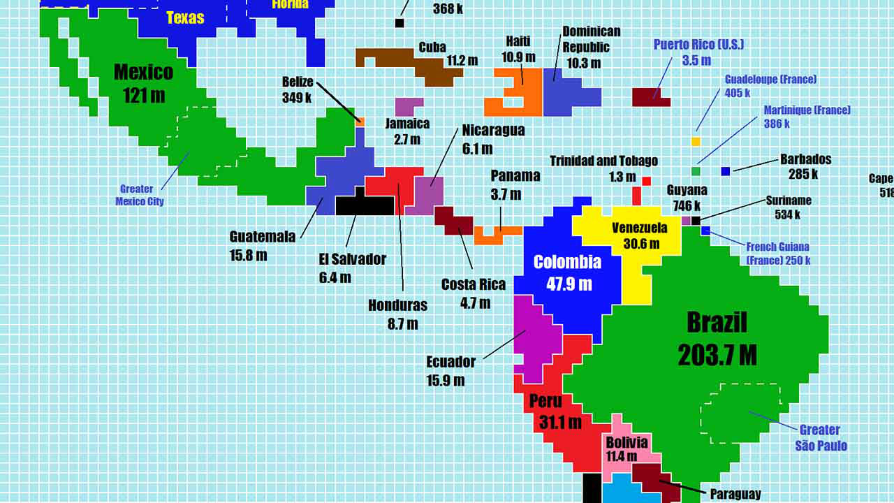
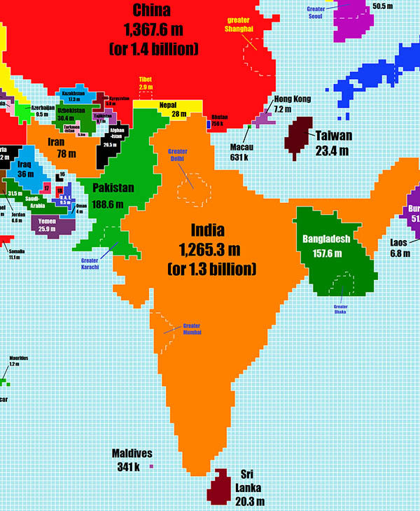
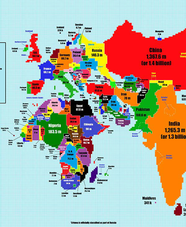
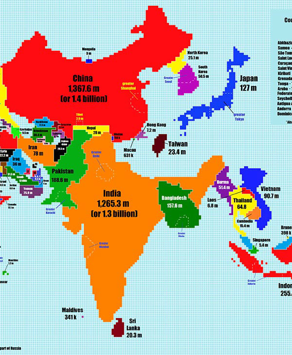
Reddit user TeaDranks took the time to redesign the world map to represent each country's size according to its population.
TeaDranks - Chase Mohrman
Report a correction or typo
Copyright © 2026 WLS-TV. All Rights Reserved.
Watch Live
ON NOW
Top Stories
Student with autism dies after being pushed by school worker: records
Met Gala 2026: Best red carpet looks
32 minutes ago
Body pulled from pond in north suburbs: police
2 hours ago
Mayor Johnson heads downstate with plan to talk about Bears stadium
3 hours ago
DOJ seeks IL voter data to purge suspected noncitizens, docs suggest
20 minutes ago
Woman falls to her death aboard Carnival cruise ship
10 minutes ago
Brookfield Zoo Chicago workers go on strike; some exhibits closed
3 hours ago
South Side principal surprised with Golden Apple Award
2 hours ago